Project 04 · Case Study
TedPrime
An educational technology platform developed to communicate programmes, resources, and digital learning opportunities through a structured and accessible interface.
Visit Live Website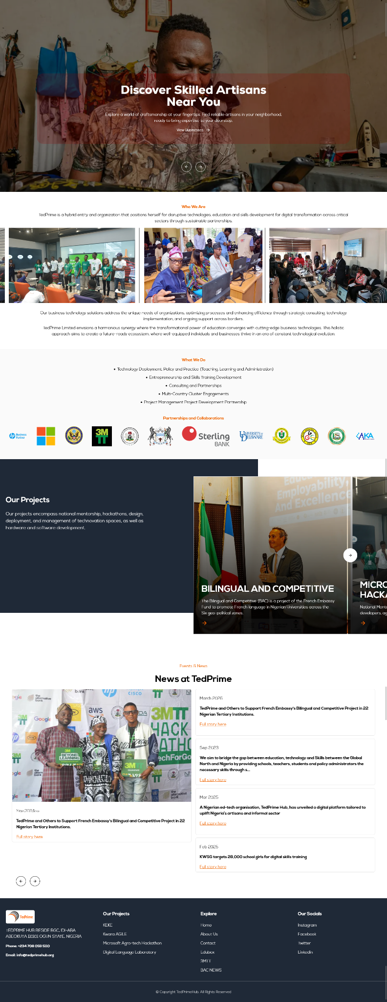
Overview
The project context.
An educational technology platform developed to communicate programmes, resources, and digital learning opportunities through a structured and accessible interface.
The website needed to represent the organisation professionally, communicate its offer clearly, remain easy to navigate, and support practical business actions across mobile, tablet, and desktop devices.
Challenge
Creating clarity without losing the character of the business.
The education platform needed to communicate programmes and resources to different audiences without losing clarity, accessibility, or mobile usability.
The solution also needed a scalable structure that could support future content without creating an overcrowded interface.
Objectives01 02 03 04 05
Organise information clearly
Create a responsive experience
Simplify navigation
Support enquiries or conversions
Strategy
Structure first, then visual direction and responsive delivery.
The project began by grouping information around the needs of the audience and the actions the organisation wanted visitors to take. This informed the page hierarchy, navigation, section order, and calls to action.
The visual direction used strong hierarchy, controlled spacing, responsive layouts, and reusable interface patterns so the experience remained consistent as content changed.
Organised around user priorities.
Homepage → Core services or products → Supporting information → About and credibility → Contact or enquiry action.
Clear, responsive, and brand-aware.
Visual hierarchy, readable typography, focused colour use, mobile-first spacing, and prominent calls to action support a consistent experience.
Development
Practical implementation for real-world use.
Education TechnologyHTML5CSS3JavaScriptPHPResponsive Development
The implementation focused on responsive behaviour, reusable components, form interactions where required, browser compatibility, efficient asset loading, and maintainable code organisation.
External links, touch targets, keyboard access, and readable content scaling were considered as part of the front-end delivery.
Solution
A stronger digital foundation for the business.
A structured information architecture, clear programme groupings, accessible interface patterns, and responsive layouts designed for easy reading and discovery.
Verified qualitative outcomes
- Created a more professional digital presence
- Improved clarity of services and information
- Made the platform easier to navigate across devices
- Established a scalable foundation for future content
Visual Gallery
Responsive Presentation
Desktop and mobile views.
The project preview is presented at desktop and mobile proportions to show how the visual structure adapts across screen sizes.